Showing posts with label Narcissism. Show all posts

Tuesday, November 08, 2016

Frustration

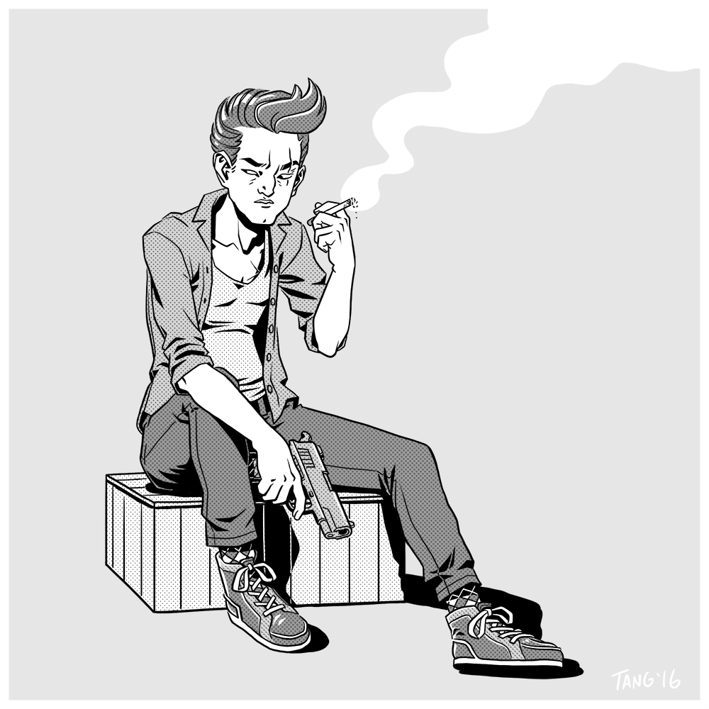
Still on my break between shows. I've been sketching a bit, but haven't finished much. The top picture was drawn quickly one night after spending the day trying and failing to fix another drawing. This drawing was kind of a palette cleanser, I drew the most of the shadows into the lineart and kept the layers to a minimum.

The drawing at the bottom shows how I feel after every work day. Katie Rice did a comic about her past jobs and the panel about storyboarding is so accurate it's actually depressing. I don't really consider this drawing finished, but I don't want to spend any more time on it, so here we are.

Watching: Niagara by Henry Hathaway , Dogtooth by , Outrage by Takeshi Kitano
Listening to: Something For Kate - Leave Your Soul to Science, Paul Dempsey - Everything Is True, Courtney Marie Andrews - Honest Life
Playing: Braid

Monday, April 04, 2016

The Greyest of Scales

I figured it was time for a new avatar. This one was inspired by the character of Richard Harrow from Boardwalk Empire who was a character I really related to. I was pretty happy with this one, it came out really quick and although I see a bunch of problems now, I think it has a nice line quality to it.

These were all drawn a couple of weeks ago but I didn't really have time to write a post. Well, I have plenty of free time right now since I've just wrapped up on the show I was working on and am having a bit of a break before I start the next one. I usually take a few months off between productions, but I don't really have that luxury this time, even though this one lasted a lot longer than usual (almost a year) and I'm only taking a month off.

I've avoided drawing shadows lately, which was mostly a byproduct of not having much time to draw, I stayed at work an hour or so longer at night so I could use the cintiq. Well, I don't have that excuse anymore.

Monday, August 10, 2015

Pulling the Knife Card

Well, it turns out that commuting and working in-house is not the way for me to achieve a balanced life. I've been working 10-11hrs a day (plus a 4 hr round-trip commute), 6-7 days a week which has left me pretty drained and with approximately zero time or energy to draw my own stuff. I did get to sublet a place close to the studio for four weeks, which cut out the commute and afforded me the time to sleep in a little, but it ultimately led me to work every single day since it was nearby.

I always get a little delirious and screwy a few months into working on a show, but I normally get to experience that in isolation and partially attributed it to cabin fever. This time around I'm in a studio full of people who get to witness my slow, steady descent into madness.

During one weekend work session, the idea that someone would do enough crazy shit to justify mass producing their own apology cards struck me as hilarious. Did I mention that I get a bit screwy? I'm sure this will be presented in court as Exhibit 01 sometime in the near future.

Watching: Skeleton Twins by Craig Johnson, Kiss Me Deadly by Robert Aldrich

Saturday, May 30, 2015

Banner Year


It was way past time for me to update the look of this blog, I've been sketching concepts for a new banner/header since January, but only half-heartedly attempting to draw them. I settled on the design with the tightest sketch, so most of the work was already done. 

I've had a lot of dental issues this year, and recently I had my bottom wisdom teeth and 2nd molars out, leaving some big holes in the back of my mouth. As a result of not being able to chew anything without debris falling into my gaping wounds, I've been on a liquid diet and have dropped 7-10 kgs.

While I could stand to lose some belly fat, I'm the sort of person who buys multiple copies of clothes when I find something that fits, so I'm stuck with a bunch of clothes that don't fit me anymore, including two pairs of my favourite Native Youth corduroy pants.

A side effect of my reduced nutritional consumption is having problems focusing long enough to draw, so the drawing to the left is me shaking the rust off. The last time I finished a drawing with a side profile head I was so disgusted with it that I spent a few days sketching them till I figured it out. But it's been a while since then and apparently I've forgotten it all. 


The drawing to the left was a rejected blog header design. I had nothing better to do at the time, so I gave it a quick ink and colour.

In an effort to start living a more balanced life, I've started a new job storyboarding in-house on a new show. The downside is that I have a long commute (4hrs a day), which means I probably won't be drawing much of my own stuff. I get to take weekends off though, so I might get to squeeze some dawing in then.


Sunday, January 01, 2012

2012: Year of the...

Feel Good Hit of the Summer
...Conformist
This January I'll be starting a new part-time job as a "Storyboard Conformer". I'd rather be drawing storyboards than conforming them, but there is only so much animation work going on at any time and plenty of available storyboard artists around to snatch up the work.

The drawing on the right is my little way of finding a little creativity in what will be a rather menial job. It was originally drawn to become a t-shirt graphic (which can be purchased here) but it reminded me of something of my favourite music poster artists, Guy Burwell has done, so I made a little mockup 45rpm record sleeve.

...Developer
Maybe I'll get a storyboard to draw, maybe I won't, but I'm not really bothered because in 2012 I also plan on developing an iOS game, which will require a huge skill jump on my part. I've been trying to put myself through a crash course in game development, intending to soak up all I can. Luckily, it seems like we are in a renaissance of indie game development and there is a lot of information around.

...Fresh Start
I wanted to start the new year clear of all my old WIPs, so I sat down to finish them somehow. These drawings have been hanging around my hard drive for a few months. I don't know why I decided to take them further than the sketch stage. The 2nd drawing's noisy gradients were inspired by Robert Valley's work, especially the new storyboards he is posting on his blog.


The next picture goes back a year and a half. I knew that if I didn't finish it now, it would never be finished. I hate the background, but I like the goofy smile. I'm tired of doing boring artwork, I'm going to make an effort to make interesting drawings this year.

Rollin' up her sleeves for pie

Watching: George Harrison Living in the Material World by Martin Scorsese, Pearl Jam Twenty by Cameron Crowe
Reading: Needful Things by Stephen King
Listening to: The Minus 5 - Killingsworth, A Very She & Him Christmas, Ryan Adams - Ashes and Fire, Noel Gallagher's High Flying Birds, Darren Korb - Bastion OST 
Playing: Left 4 Dead 2, Bastion, Cave Story+ and LIMBO

Friday, July 01, 2011

Girly Bits & Pieces

The picture on the left existed as a rough sketch for a few months but I didn't get to start work on it because I had a bit of freelance work come up. This was the first thing I worked on after that job wrapped up.

In hindsight I should have used clubs instead of hearts to match the shape of her hair. 

This design is available as a T-Shirt at MySoti and RedBubble (also as a sticker).


This is a good example of how I take very simple concepts and make them unnecessarily complicated. I planned on this being only one colour (yellow) with thick black lines to look like it was drawn with a sharpie on a post-it. I should've stopped myself when I started drawing shadows.
On the flip side, I only had a vague idea about how this should look when I started and as a result, this took a lot of time to find a look.
These two pictures are blacked out because they might be too risque for this blog. You can click on the thumbnails to see the NSFW pictures. 

I've been stuck on 3 or 4 drawings and I really wanted to just whip out a drawing so I whipped out a quick self portrait.

I've been using my DSLR to "scan" sketches and while taking a photo of this sketch I decided to also take a  photo of the piece of cardboard I use under my laptop (because I've been using my bed as a desk for the last few months) to use as a background texture. I tried adding details and highlights, but I think it looks better without it.  
Reading: Bossypants by Tina Fey, Lucifer's Hammer by Larry Niven and Jerry Pournelle
Listening to: Whiskeytown - Pneumonia, Someone Still Loves You Boris Yeltsin - Let It Sway, Big Star - No.1 Record

Wednesday, December 22, 2010

My Name Is URL

It's been a while since my last post; since then I worked on an animated TVC where among other duties I got to do clean-up on two scenes that were animated by Robert Valley. It was pretty cool, since I've been a fan of his work for a while. I also just finished working as a Flash monkey on TV show, just doing production grunt stuff. Both jobs had a very short time frame and extremely long hours so my hands haven't been in the best condition. 


Yet another Girl ün Girl polaroid. I think I was trying to keep the picture loose, not framing the shot perfectly but I found out with this one that if I try to frame "off" it has to be off by a lot. I had to redo this picture a bit to remove some space from the red synth to Madeline and to give her more headroom. 

I think the set dressing is a little lacking, but I like the lighting. I hate Christmas, but I love it when people use Christmas lights in interior decorating.

This was inspired by many girls I saw on the train on the way to work.One of the benefits of living in such sunny climes is the popularity of short shorts. 

The book she's holding is Lolita by Vladamir Nabakov, which I have not read yet, but have included for obvious reasons.


I guess this is the first post I've made since getting a proper URL. It was one of the many things holding up progress on designing a business card.

This picture was for the back of the card. I hope the design of the card is light-hearted enough for people to overlook the rampant narcissism on display. 

These next two redheads (I just noticed that all the girls I'm posting are redheads) have been in the backlog for quite a while, coloured, but not quite finished. I added word balloons with Wilco lyrics in them and declared them done. Both are just Photoshop doodles that I started while trying to avoid working on more complex drawings. Sometimes I just want to draw a cute girl with a goofy smile.


I've got quite a few pictures waiting for backgrounds or a little more finessing. I'm going to try to finish them before the year's end , but everything is dependent on the condition my hands are in. It doesn't help that I bought a ton of games during the Steam black friday sale.


Watching: Shutter Island by Martin Scorsese
Reading: Wilco: Learning How To Die by Greg Kot, The Mutt: How To Skateboard and Not Kill Yourself by Rodney Mullen, Scott Pilgrim Vol.6 by Bryan Lee O'Malley
Listening to: The Black Keys - Magic Potion, Uncle Tupelo - Still Feel Gone, Giant Drag - Hearts and Unicorns

Monday, September 27, 2010

The Many Faces Of

I've been trying to come up with a new ID/Avatar picture for forums and such so here are some of the self portraits I've come up with.

The first one was done in a Charles Burns-ish style. I read fewer indy comics these days, I think the last one I read was Wilson by Daniel Clowes.

I find them less appealing as I get older, the art is often split between over-detailed/clean or child-like chicken scratch and the stories often seem detached, like the cartoonist is standing outside the story and laughing. Earnestness is more appealing to me these days.

I don't want to come down on indy comics though, there are some great ones, but the 90% rule applies to everything after all. 


This one was done in a similar style but with a more idealized face. It's done as a business card, which I think looks okay as a mock-up, but in reality it would be pretty stupid for a professional sneak to advertise his face. 
That was always something I hated about the James Bond films; why would a spy tell people his real name. It became so absurd that I came up the conceit that "James Bond" was a job title rather than a name, which would explain the different actors (I'm told this is now the case in the newer movies) but even then it would still be stupid. I guess I like my spies more Baer than Bond. 


This one is a rather bland Stephen Silver-esque self portrait. I think the more "polished" I make my work, the more uninteresting and bland it becomes. I came to the realization that I want my work to still be amateurish, not in way that implies lack of ability, but in a way that maintains amateurish enthusiasm. I believe Francis Ford Coppola once said something similar to that effect.

It kind of works against me trying to work as a professional, and I find myself not polished enough to be "professional" and not loose/enthusiastic enough to pass as "artsy". Now I think of it, Coppola is also often put into the same boat.


Me in a couple years time? It's possible. Sometimes I just like to play with shapes when I sketch and I guess out of that comes something like this. I always though that if my life were made into a movie I would like Philip Seymour Hoffman to play me.


Watching: Strangers On A Train by Alfred Hitchcock
Reading: Flowers For Algernon by Daniel Keyes
Listening to: V______ - The Wheels Of Progress

Tuesday, July 13, 2010

New Citizens

(EDIT 2015: Added header image.)
New header! I've been putting this off for a while, I tried to draw all sorts of people and things to populate the foreground, but nothing looked right. I guess I can always add things later.

Oh, god! This picture has been in the backlog for ages, I didn't know how to colour it and tried many backgrounds, but nothing stuck. I guess I still like it.

I originally drew these pig-carrying socialists to populate the new blog header but it didn't look right, so here they are: HAPPY FREE PIG DAY!


I've cut down on the number of podcasts I listen to now. Tell 'em Steve-Dave tops the list as my favourite new podcast, it's by Kevin Smith's New Jersey friends: Bryan Johnson, Walt Flanagan and Brian Quinn. I feel that it's funnier than SModcast, which in all honesty has gotten a bit stale.

Another View Askew-niverse podcast I've started to listen to is Highlands: A Peephole History which features the above-mentioned Kevin Smith, Bryan Johnson and Walt Flanagan talking about their history in Highlands, New Jersey.

Tweet Me Harder is a funny and at times surreal podcast by web-comic artists David Malki with Kris Straub.

Making the return cut:
No Agenda
This American Life (I finally finished going through the archives, all 411 episodes)
Planet Money
This Week In Tech
Engadget
Red Centre
The History of Rome
Hardcore History
Common Sense with Dan Carlin
Creative Screenwriting
American Society of Cinematography

Watching: Gran Torino by Clint Eastwood
Reading: The Botany of Desire by Micheal Pollan
Listening To: Sonic Youth - Sonic Nurse

Sunday, January 24, 2010

That Yellow Bastard

Photoshop CS2, Intuos3

Another self portrait. It's a response to the frustration I feel when it comes to drawing comics. I've got a major case of Page Fright; I wrote a little four page story a week ago (ITWSSOP) and I'm certain that my story beats have ruined what I intended this story to be. I spent a few days doing character designs; I'm happy with the designs, but my drawing has become atrocious, I don't have the discipline anymore.

I'll do anything to avoid drawing a comic, my most frequent excuse is that I'm not ready, that I don't have the ability yet to draw what is required to tell this story properly. I even came up with a premise for another short comic I could do to "work my way up" to drawing ITWSSOP which upon reflection will be harder to draw!

My Gretsch is also driving me insane. I think I now know how it feels to have a beautiful yet malicious girlfriend, it feels like I'm in an abusive relationship. There are things about it that drive me INSANE, but I can't bring myself to hate it. I guess I have to put back in its case because it is my number one distraction, the internet is a close number two.

Sigh, I've been nowhere as productive as I was during my first hermitage. Time to grow some balls.

Watching:
Shut Up and Sing - The Dixie Chicks
Reading: Carpe Jugulum by Terry Pratchett
Listening To: Sound clips of various TV Jones Pickups

Wednesday, December 30, 2009

I, Me, Mine

More narcissism. I've been contemplating getting an Epiphone Casino, the guitar most commonly known as the guitar John Lennon and George Harrison used to play. McCartney also mentioned that if could only have one guitar it'd be this one. So here's me in my own Beatles-esque rooftop performance:


I don't think the guitar is available in this colour since I based it on John Lennon's Casino, which he sanded the paint off of.

I'm in the habit of sitting down to draw in the afternoon and colouring all through the night and it's easy (in the wee hours of the morn) to make the mistake of getting caught up in details and losing sight of the whole. The next morning (or noon) is usually spent correcting mistakes. I made the mistake of not cropping the page, and I ended up with a composition that isn't ideal. The biggest mistake was that I made a background for it at all since I think the picture looks better like this:

ACHTUNG! Guitar talk ahead:
Here we have the Casino head to head with the Gretsch Electromatic G5120 (I'd prefer it in White, which is a rare colour, but I wouldn't mind it in a classic-Gretsch Orange). It's an entry-level version of the Gretsch 6120 which is a Chet Atkins signature model. The Pros and Cons of the two guitars pretty much even themselves out:

The Casino has great P90 pickups, pinned bridge (easier to maintain) and is cheaper than the 5120, but has a front facing lead-jack and no Bigsby Vibrato.

The 5120 is loud even when unplugged, has a floating bridge(holds tone better during vibratos), a Bigsby Licensed Vibrato and is very popular for modifying, but has mediocre humbucker pickups (I prefer single coils).

Aesthetically I prefer the single cutaway style of the Gretsch and I'm uncertain if I prefer the technically superior Alnico P90 pickup sound of the Epiphone to the Gretsch-buckers (which I'd swap out for TV Jones Classics eventually). The P90s have a great chimey sound and fuzz up nicely, but Gretsches have a twangy bite to them. I'm not really a huge vibrato-person but I like the fact that's it's available on the Gretsch.

To continue on my Beatles jag, we've got a cute little Höfner Bass (albeit a right-handed version, sorry Paul) running through a Hartke amp head and Marshall stack. I really hated this drawing for a long time (from scan to character colour) because of the kind of janky forced perspective. I made the mistake of not pushing the perspective enough. That's kind of what characterizes my personal work I think, a mediocrity born of fear/laziness/ignorance. It's weird because I push the poses and designs of my commercial work pretty far. Is money the motivator? Na, I'm pretty sure it's just me not wanting to look like a hack in front of other artists.

Next up we have a Coles Phillips-style fade-away girl. I found this sketch in my junk folder and just tooled around with it for a little while. Unfortunately I didn't have a book title that could provide subtext to this drawing (because it's just a meaningless sketch or in other words: there is no text, therefore there is no subtext) so I just wrote in the name of the audio-book I was listening to at the time; Blue Beard by Kurt Vonnegut. Audio-books are awesome, especially while the hands are busy doing tedious things like doing clean-up or using Photoshop.
Last up is just a quick sketch I threw some quick colours and a vignette on. I read somewhere about a thing the kids do these days where they make little bizarro-tattoos by masking off an image on their skin and jumping in a tanning booth. This leaves an image/pattern of pale skin. I thought this was a pretty ingenious way of having a non-permanent reverse-tattoo. Those crazy kids, what'll they come up with next?

Watching: Inglorious Basterds by QT
Reading: Martian Time Slip by Philip K Dick
Listening To: Powderfinger - The Golden Rule, Bob Dylan - Christmas In The Heart, Blood, Sweat and Tears - Child Is Father To Man

Saturday, August 15, 2009

Art In The Time Of Tendonisis

More narcissistic pictures. I think I keep drawing these because they're so easy to do. I've been spending hours on drawings I can't (or won't) finish and sometimes after ripping the pages off of my drawing board and throwing them to the floor, I'll slap down a quick sketch of something easy.

The first picture was supposed to be very graphic/cubist but I didn't know how to shape the colour.

And here's the chiaroscuro version. I'm really starting to like the line-less look. My travellin' buddy Woric has been doing something like this for a while. I want to draw a short comic using this look.

I did this sketch a long time ago, but couldn't find a colour scheme. Finally, I decided on greyscale and one colour.

This was a drawing I did after a period of tendonisis. It's been flaring on and off for the last few weeks. I think I might have a rough week coming up...

Sunday, June 14, 2009

Monochrome

I've just about given up on colour. I just can't figure out how to use it. I've been meaning to do more black and white and greyscale work anyway...


I finished storyboarding my last episode, so I hope this gives me more "hand time" to draw my own stuff.


This is how I felt after having to use FLASH CS4 for the first time at work. Give me back my pencil! (I'm not a total luddite though, I just installed CS4 in my Windows 7 virtual machine).


This came out very different from the original sketch. The sketch had more attitude, the hips and shoulders were more opposing. I lost more attitude when I removed the lines, the mouth and eyes were more intense. Oh well, it's a fair trade-off as like the Coles Phillips' fade-away girl look.