Click pictures to view in Lightbox Mode
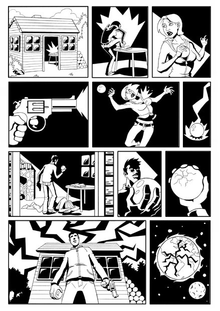
This is the first comic I've made in years. It's not really the type of story I have in mind for this character, but the gag seemed simple to execute. It was initially two pages long, but after I drew it, I realized that it didn't read clearly, so I drew a new page (page 1) and shuffled panels around to set the premise up a little more clearly. I think the comic is a bit of a failure due to the mashed up layout (and the weak execution of the passage of time sequence), but it was still refreshing to draw a comic again.
Showing posts with label Comics. Show all posts
Thursday, September 19, 2013
Tuesday, March 16, 2010
Love Is A Drug

Well, this didn't go according to plan. I always envisioned this in a Tommy Lee Edwards 1985 brush style but that that wasn't a very realistic expectation. I dragged this page out far longer than I ever intended; it was a very start-stop affair, I started drawing this in mid February and completed five of the seven panels pretty quickly. Then I tried to draw the establishing shot, got frustrated and start working on something else. I would try to get back into it, but my attention would wane and I ended up drawing panel one and four weeks later directly in Photoshop with the Wacom tablet. I don't think this comic works very well but I'm not too disappointed, it was a throw-away idea anyway, I mean, how can I attempt to write about love if I've never experienced it? It's just shmaltz.
I laid the page out with the lettering planned, but during the process of digital inking and compositing, I moved stuff around a bit which resulted in the lettering ending up a little disorganized and it left no space for the title. I used Tekton Pro Bold for the lettering again, I should really try to find a new font or make one up for next time. I created the word balloons with a method I learned from Nate Simpson's blog, it's a simple and effective way of working.
(EDIT: I changed the font to Comic Sans. Yeah, THAT Comic Sans.)
I wanted to use solid black shadows, but chickened out again, it really is something I need to plan in the layout stage and carry out through the pencils and inks. I think I need to do another Mignola style comic.
Despite my dissatisfaction with how this page came out, it caused me to remember something very important (especially in 1-8 pagers) about page layout: every page needs a focus and it needs to show in the panel composition. The layout of this page is boring, everything is too even and the panel heights are too similar, this tells me that there is something wrong with the way I am telling this story.
Watching: McCabe and Mrs Miller by Robert Altman and It Might Get Loud by Davis Guggenheim
Reading: The Sundance Kids by James Mottram
Listening To: Swamp Dogg - Rat On
Saturday, February 13, 2010
The Ocean - Teardown
I wrote this little comic in 2005-2006, I don't know when exactly, it was my post-animation school period, and I think that is reflected in the story. Most of my "stories" in that period were very open-ended, barely stories, more like vignettes. I was influenced by the films of the French New Wave and Jim Jarmusch who rejected Hollywood storytelling conventions and didn't feel the need to explain everything.I penciled the comic in November, I intended to use it as a warm up exercise for a period of prolific comic creation. It didn't turn out that way. I spent a lot of time doing layouts, some panels I planned years ago when I wrote it (like page 1 panel 2 and page 2 panel 1) but I mostly just tried different shots till I got something I was 70% satisfied with (compromises had to be made as always) .
The way I lay a page out is very influenced by Will Eisner, who liked to have a page be a complete scene or end on a significant turning point in the scene. I think I managed to end each page in interesting ways, each page had a different function although the main goal is to draw the reader deeper into the story.
It was such a struggle to get the facial expressions and body language to be even close to what I had in mind, the car didn't look convincing and I don't know how to draw water. I also should have done character designs because whenever I make something up on the page it turns out very generic. On top of all that, I found page 3 panel 2 to be impossible to draw in it's original layout and had to change it from a high angle shot (which creates a dread of the cliff edge and water) to a low angle shot, which is maybe too dynamic, it causes the eye to move too fast to the next panel and takes away from the suspense. At that point I was just despondent and just wanted to finish it. That lack of enthusiasm resulted in the the last three panels of page 3 being just rubbish. I ended up redrawing them completely in Photoshop. I was so disgusted with my drawing, I couldn't bring myself to clean up and finish the comic.
Fast forward two unproductive months, I started writing again and did the layout for a four page comic. But as always, I was too scared of starting and as a way of postponing the actual hard work of drawing, I started to digitally ink The Ocean. It took a day per page and to my surprise, it started to look a lot better. I sometimes draw different panel elements on different pages, so I can resize and move stuff around later, so the inking process allowed me to see the pages in their more or less final form.
I originally had plans to watercolour/ink wash the pages, but it was pretty clear that I had no idea how, so I decided to use halftones. I put in the shadows and water (which I am actually happy with!) using different grey values. Now when it came to turning the grey into halftones, I couldn't get the look I wanted, so I just scrapped them, I was happy with the greys, no point in ruining them with dots.
I lettered the comic using Tekton Pro, which is a bold font, I would have preferred to use the regular version, but alas, Adobe charges $25US for it. I am totally incompetent when it comes to lettering, but this was probably my best attempt so far. The main problem was that there would sometimes be a huge amount of text and I had up-sized some drawings during inking and had to rewrite bits so they would fit.
So after all is said and done, I think the comic is somewhat successful, the drawing could have been better and maybe I should have laid out the last 3 panels differently, but on the whole it communicates the mood and pacing I originally intended. Job Done.
Wednesday, February 03, 2010
Friday, March 24, 2006
Autobio comics

Retrospective. Another kinda old one, I've been trying to get back into animation mode, so I haven't been spending much time doing any illustration, storyboards or comics. This was for the January monthy challenge at the PulpFaction.net forums. The specs were that it be 1 page in length, contain a shell or shells (it's in panel 5) and the subject was autobiography.
I drew this in blue pencil and went over it with a 0.5 hb. I photoshopped the blacks in as usual. The panels in the mid section were kinda disappointing, the thumbnails looked pretty good, but the figures ended up too stiff in the final and some of the panel compositions are a little off. It was pretty fun to draw though.
Wednesday, March 22, 2006
ITW page 08

Retrospective. The last page. I had problems laying out this page and I think it shows. It's too horizontal, too even, not enough variation in the pacing. The worst thing about this page is that I put so much black in the middle, and as a result, I didn't get the contrast I wanted between the first panel and the bottom row.
The first panel looked really good in roughs, but it came out the worst after clean up, maybe I rushed it. Panel ten was really hard to draw, I redrew that guy a few times and I still don't think I got it right, gotta do more lifedrawing/anatomy studies.
Oh well, I think I learnt some important lessons from doing this comic, so hopefully the next one will be a lot better.
Sunday, March 19, 2006
ITW page 07

Retrospective. I burned through the figures really fast, they were pretty easy to draw. Panel 8 was not in my original thumbnail and in the final version, the "camera" is a little too close because I was worried that they wouldn't be visible if I drew them smaller.
I didn't spot my blacks, so they're really sporadic on this page, after a few pages with lots of darkness, I couldn't wrap my head around daylight. The line work is a little too fine as well. And when cleaning up the page, I developed a "cleanup callous" and my hand fused into a "cleanup claw", they hurt, but they're like battle scars, wear them with pride.
Tuesday, March 14, 2006
ITW page 06

Retrospective. This was pretty easy to draw and to clean up because there is so much black, so the lines don't need tapering. I think the page is a little unclear because of the lack of backgrounds. I don't like the poses in the last four panels, they're a little too clumsy.
Those heads were kind of difficult to draw, I haven't had much experience drawing anything like that, I just ended up scribbling designs in my sketchbook, then cleaning it up and resizing and fudging in Photoshop.
Monday, March 13, 2006
ITW page 05

Retrospective. Man, this was a nightmare to draw, the designs are really crappy, I really should have used some reference of sculpture and gotten a little wilder with the design. I think my linework is too thin and as a result, it's a little bit confusing and some panels look really wrong.
The idea for the page kind of changed when I was pencilling it, so it seems kinda corny. Suprisingly, I like it better than page 04. (and yeah, that is me "paying homage" to Hellboy: Wake the Devil.)
Sunday, March 12, 2006
ITW page04

Retrospective. This page was really fun to draw, but it didn't come out that well. The figures in panels 01, 03 and 04 are smaller than I intented.
I think it flows okay and the swimming poses are pretty good especially since I've never drawn anyone swimming before.
Wednesday, March 08, 2006
ITW page 03
Retrospective. I kinda drew myself into a corner. I drew all the panels with the girl including that ghost-thing's shadow, before I had "designed" the thing (the ghost-thing in panel one is ver 2.0, it originally looked like it does in panel 04, I hate this version too) and was stuck with the shape, and the problem of drawing a non-solid....thing added to the overall crappiness. I'm actually really disappointed with how the first panel came out, my blue pencil drawing of the panel looks okay, and even the cleaned up version looked all right until I added the blacks in photoshop. Panel 1 was also the only panel I did in layers, and the framing had to be fudged a bit in pshop.
I kinda like panel 02, I think it was the first panel I did and it was really fun to draw. The other panels are kinda awkward, I wanted some weird pacing, I don't think it worked that well though. Still figuring that out.
Sunday, February 26, 2006
ITW page 02

Retrospective. This page was a pain to do, I drew each panel on a seperate page, so it doesn't seem cohesive. I hate the 2nd and 3rd tiers, the blacks are inconsistant. I forgot to indicate a background for panel 7, the fireplace was supposed to be on the right, which would suggest that she has turned away, which was why I broke "screen direction". Not much else to say about this page. I redrew the bottom tier multiple times, I'm kinda satisfied with it. Kinda.
Saturday, February 25, 2006
ITW page 01

Retrospective. I did this page.....October? It was the weekend of the Supanova convention in Sydney. I didn't go.
I'm really into Mignola's Hellboy work, the way he gently maneuvers the reader from panel to panel, the way he leads the eye around the page, how he speeds sequences up, then brings it to a screeching halt. At first sight, Mignola looks like he breaks the principles of good sequential art, but his juxtiposition of vertical and horizontal panels read flawlessly. Anyway, I wanted to study the way he does this, so this page was the first experiment. A failed experiment.
First up, I love the way Mignola will do a full shot in a vertical panel and then, underneath, a close up in a short horizontal panel. The eye travels from top to bottom, even though a horizontal panel should lead the eye across. In Mignola's case, it leads down because both panels read as a cohesive column. I tried it here, and it failed to read vertically. I analysed the page and I figured out that it only works on the right side of the page!
I redrew the 2nd column multiple times, with different angles, and none of them worked. On the top panel my intention was to have he girl walking up an incline in the foreground plane and the background would be looked down upon by the viewer. As you can tell, I suck at drawing backgrounds and I should have used different lighting to seperate the foreground and background planes (the lighting is all over the place on this page). The next panel was supposed to be a "deliverance" style stalker shot of the girl walking up a little incline. It didn't work because 1) the girl's shadow is too big and attracts the eye too much to notice the silhouetted bushes in the foreground.
Well that's it for this page. It's a failed experiment, but I learned a thing or two from it.
Wednesday, February 22, 2006
In the Woods...
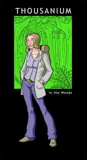
A hoy-hoy, my name is Tang Lee and I started this blog to keep track of the various projects (comics/film/animation) I work on and to comment on different aspects of the creation process.First up is the title page to a comic I'm currently working on. In the Woods is a project I started because I was stuck for ideas for a short comic (I have lots of comics and scripts written, but I'm not going to start on those until I improve my drawing abilities). I decided to just write and draw it one page at a time, with a loose structure guide (pg1 intro, pg2 complication, pg3 overcome etc..) it may seem a little "paint by numbers", but it frees me of structural problems, so i can just focus on telling the story and experimenting.
I consider story and art to be the same thing in comics, being a visual medium, stories are told by pictures, pacing, characterization etc... are defined by images. Another reason for me doing this comic was to experiment with different visual storytelling techniques. Some of these experiments failed, but I'm learning from the mistakes.
Subscribe to:
Posts (Atom)